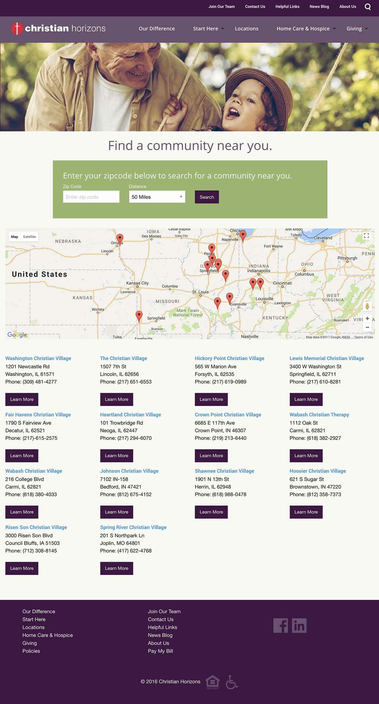
A new name and image was needed for Christian Homes to reflect updates in offerings by the organization. Consisting of with thirteen Midwest communities, they were moving from less reliance on nursing beds and more emphasis on home services and rehab. Direction included maintaining the word “Christian”, the names of the individual communities.
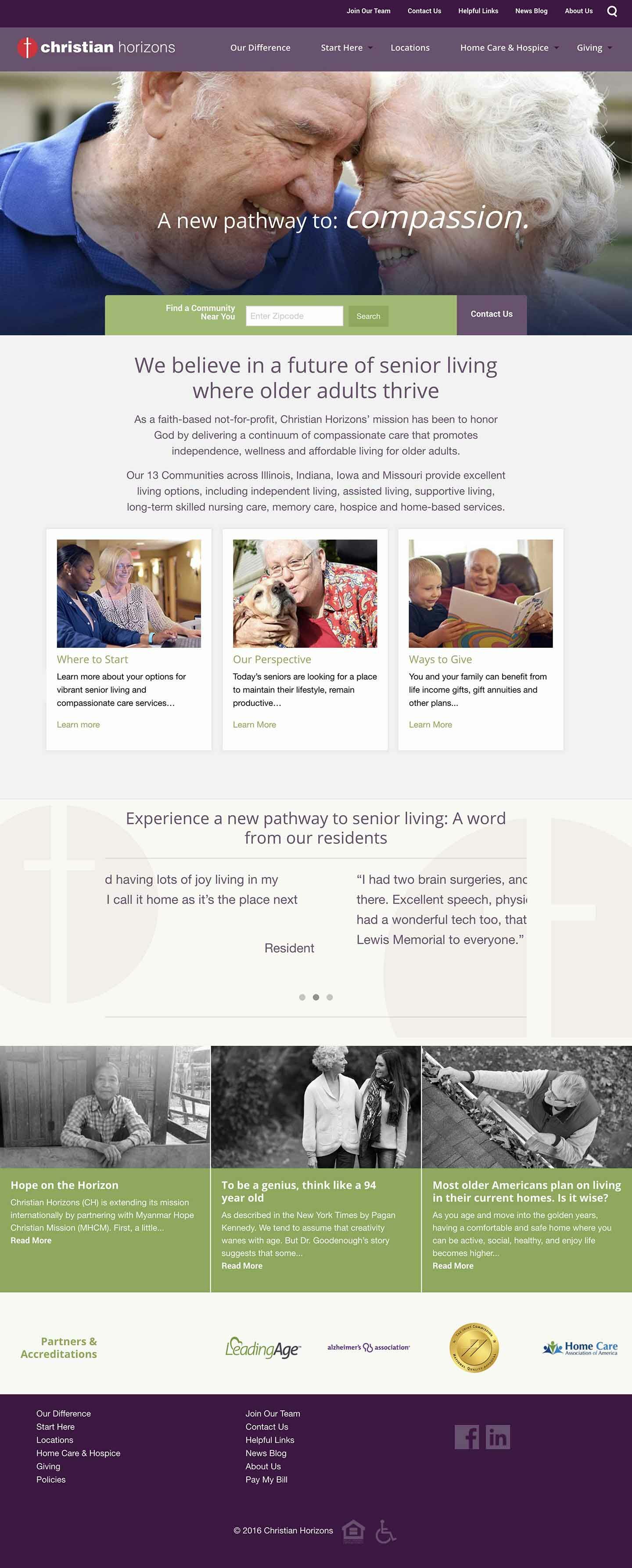
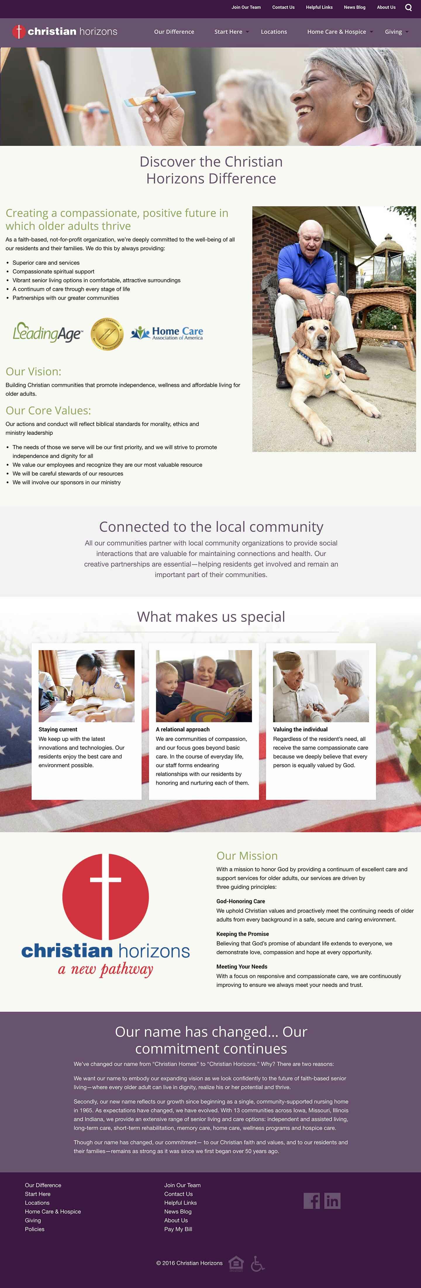
A new brand name, logo and website were developed based on research, meetings with stakeholders and community visits. Loosing the negative word “Homes”, Christian Horizons now emphasizes a positive, forward thinking organization. The logo redesign maintained the existing type face and logo mark, to maintain equity and protect donor support.
A robust, contemporary website was launched using clean, sophisticated design and bes- practice architecture and SEO. The enhanced user experience now appeals across the spectrum of potential employees, residents, adult children donors and referral sources.
Just introduced with orchestrated internal campaigns, the website and rebrand received enthusiastic approval from the communities and leadership. Analytics are in place to begin tracking as campaigns are set to launch.